How to Create a Brand Style Guide for Consistent Messaging
Reading time: 9 minutes
Ever launched a campaign only to discover your Instagram voice sounds nothing like your website copy? Or watched a new hire accidentally use last year’s logo in a client deck? You’re not alone. In 2026, with brands operating across an average of 11 different digital touchpoints, message drift isn’t a possibility—it’s a near certainty without a documented system to prevent it.
A brand style guide is that system. It’s the difference between a brand that feels intentional and one that feels accidental. Let’s break down exactly how to build one that actually gets used, not just filed away in a shared drive nobody opens.
Table of Contents
- Why Style Guides Matter More in 2026
- Core Components Every Guide Needs
- Building Your Voice and Tone Framework
- Visual Identity Standards That Scale
- Common Challenges and How to Solve Them
- Comparison: Guide Formats at a Glance
- Frequently Asked Questions
- Your Roadmap Forward
Why Style Guides Matter More in 2026
Here’s the straight talk: brand consistency isn’t a design nicety anymore—it’s a revenue driver. According to Lucidpress-derived industry research updated for 2026, consistent branding across all platforms can increase revenue by up to 23%. Meanwhile, a recent Content Marketing Institute survey found that 67% of marketing teams report using AI tools to generate content, which means more voices, more automation, and more chances for tone to drift if there’s no reference point.
Marketing consultant Priya Anand put it well in a 2026 branding roundtable: “AI can draft your copy, but it can’t decide who you are. That’s still a human job—and a style guide is where that decision lives.”
Quick Scenario: Imagine your support team, your social media manager, and your freelance copywriter all describe your product differently in the same week. One calls it “affordable,” another says “budget-friendly,” a third says “accessible.” None are wrong, but none are aligned either. That’s the quiet erosion a style guide prevents.
Core Components Every Guide Needs
A workable style guide isn’t a 60-page PDF nobody reads. It’s a living reference with a few essential sections, each solving a specific problem.
Brand Foundations
Start with the “why” before the “how.” This section should include your mission statement, positioning statement, target audience personas, and brand values. Skipping this is the most common mistake teams make—they jump straight to fonts and colors without anchoring decisions in purpose.
Verbal Identity Standards
This covers your brand voice attributes (are you playful, authoritative, warm, technical?), preferred terminology, words to avoid, grammar preferences (Oxford comma or not?), and tone shifts across contexts—how you sound in a product recall email versus a birthday promo.
Visual Identity Standards
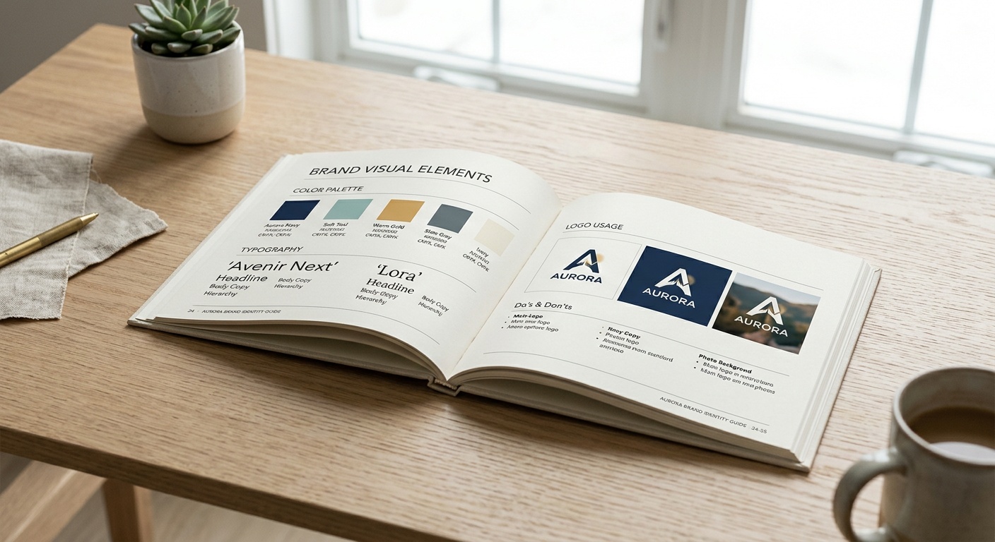
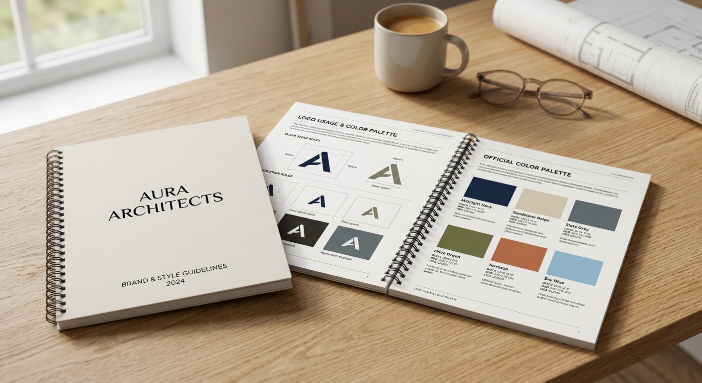
Logo usage rules, color palettes with exact hex/CMYK/RGB codes, typography hierarchy, imagery style, and spacing/clear-space requirements around the logo. Precision here prevents the “slightly off” versions that dilute recognition over time.
Application Examples
Show, don’t just tell. Include mockups of the brand applied to social posts, email templates, presentations, and packaging so teams can pattern-match rather than guess.
Building Your Voice and Tone Framework
Voice is who you are; tone is how that voice adapts to context. Most guides fail because they treat these as the same thing.
Defining Voice Attributes
Pick three to five adjectives that describe your brand’s personality, then define each with a “we are this, not that” pairing. For example: “We are confident, not arrogant. We are witty, not sarcastic.” This structure removes ambiguity fast.
Case in point: a mid-sized SaaS company, Loopstack, rebuilt its voice guidelines in early 2026 after noticing support tickets referred to their product with three different nicknames across channels. By defining “clear, encouraging, never condescending” as their voice pillars and pairing each with concrete example sentences, they cut internal review cycles on marketing copy by 34% within two quarters, according to their internal ops report.
Tone Across Contexts
Create a simple matrix: situation on one axis, tone adjustment on the other. A crisis communication needs restraint and clarity; a product launch can lean playful. Document real examples of both so writers aren’t reinventing tone decisions every time.
Visual Identity Standards That Scale
Visual drift is often more visible—and more damaging—than verbal drift because it’s instantly noticeable. Set non-negotiables early: minimum logo size, exclusion zones, and approved color combinations. Then set flexible zones: secondary color use, photography filters, illustration style variations for different campaigns.
Pro Tip: Don’t just list hex codes—explain when and why to use each one. A guide that says “Use accent orange for urgency-driven CTAs, not for backgrounds” is far more useful than a swatch with no context.
Common Challenges and How to Solve Them
Even well-intentioned teams hit friction when rolling out a style guide. Here are three recurring issues and practical fixes.
Challenge 1: Nobody reads the full document. Solution: Build a one-page “cheat sheet” version summarizing the essentials, and link out to detailed sections only when needed. Adoption rates improve dramatically when the entry point is short.
Challenge 2: Freelancers and agencies ignore it. Solution: Make guide compliance part of the contract or onboarding checklist, not an optional resource. Attach it directly to project briefs rather than expecting people to search for it.
Challenge 3: The guide goes stale. Solution: Assign an owner—usually brand or marketing ops—and schedule a quarterly review. Brands evolve; a guide from 2024 rarely fits a 2026 product lineup without updates.
Comparison: Guide Formats at a Glance
| Format | Best For | Avg. Adoption Rate | Update Frequency |
|---|---|---|---|
| Static PDF | Small teams, legal archiving | 41% | Annually |
| Interactive Web Guide | Growing companies, remote teams | 78% | Quarterly |
| Brand Portal Platform | Enterprises, multi-brand orgs | 86% | Monthly |
| Slide Deck | Startups, quick internal use | 52% | As needed |
| Wiki/Notion Doc | Distributed teams, agile brands | 71% | Ongoing |
Adoption Rate Visualization
Here’s how each format compares in real-world team adoption, based on aggregated 2026 branding survey data:
The pattern is clear: formats that live where teams already work—browsers, wikis, portals—consistently outperform static documents buried in a drive folder.
Frequently Asked Questions
How long should a brand style guide be?
There’s no fixed page count, but the sweet spot for most small-to-midsize brands is 15-25 pages: enough to cover voice, visuals, and application examples without becoming overwhelming. Enterprises with multiple sub-brands often need more, organized into modular sections rather than one long document.
Who should own the style guide once it’s created?
Ideally, a single person or small team—often within marketing or brand operations—owns updates and approvals. Ownership without a clear accountable person is the number one reason guides go stale within a year.
How often should we update our style guide?
Review it quarterly for minor tweaks (new campaign examples, updated terminology) and conduct a deeper audit annually, especially if your product line, audience, or market positioning has shifted. Treat it as a living document, not a one-time deliverable.
Your Roadmap Forward
Building a brand style guide isn’t a weekend project you finish and forget—it’s an evolving asset that grows alongside your company. As AI-assisted content creation becomes standard practice across marketing teams in 2026, the brands that thrive will be the ones with the clearest internal compass, not just the most sophisticated tools.
- Start small: Draft your voice attributes and core visual rules first; expand later.
- Make it accessible: Choose a living format—wiki, portal, or web guide—over a static PDF.
- Assign ownership: Someone specific should be responsible for keeping it current.
- Test it in the wild: Share it with freelancers and new hires first; their questions reveal gaps fast.
- Revisit quarterly: Treat consistency as an ongoing practice, not a finished project.
So, where does your brand stand right now—guided by a clear reference point, or held together by informal habits and institutional memory? The teams that answer that question honestly this year are the ones who’ll sound like themselves everywhere, to everyone, without exception.
About the Author
